CSS3最强布局-Grid布局
 菠菜707约 19 分钟
点击 关注 公众号,“ 技术干货 ” 及时达!
grid的布局的使用
0.flex布局痛点
当我使用到flex的 属性:
justify-content
属性中
space-between;
space-around
space-evenly
属性值来处理空白区域的分布,最后一行可能会出现间隔过大的情况
<!DOCTYPE html>
<html lang="en">
  <head>
    <meta charset="UTF-8" />
    <meta name="viewport" content="width=device-width, initial-scale=1.0" />
    <title>Document</title>
    <style>
      .box {
        margin: 50px auto;
        display: flex;
        flex-wrap: wrap;
        width: 600px;
        height: 300px;
        border: 5px solid #3333;
        justify-content: space-evenly;
      }
      .box div {
        width: 100px;
        height: 100px;
        background-color: #f509f1;

        border: 1px solid #d2d0d0;
      }
    </style>
  </head>
  <body>
    <div class="box">
      <div>1</div>
      <div>2</div>
      <div>3</div>
      <div>4</div>
      <div>5</div>
      <div>6</div>
      <div>7</div>
    </div>
  </body>
</html>
1.gird是什么?
CSS 网格布局 (Grid Layout) 是 CSS 中最强大的布局系统。这是一个二维系统,这意味着它可以同时处理列和行。 gird(网格) 布局与 Flex 弹性布局有相似之处理,都是由父容器包含多个项目元素的使用。2.兼容性
下面是网格系统兼容性数据,你也可以在 https://caniuse.com/ 网站查看,所以在根据项目使用的场景决定是否使用网格布局。
在2024的今天现在浏览器版本基本都是100以上 ,大可放心去使用 但是如果你的客户还在使用用
IE
就尝试其他布局方式吧,
虽然IE已经没了
,不排除其他用户还在使用
3.声明容器
1.块级容器
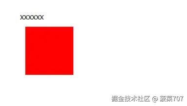
-
display: grid
;
<!DOCTYPE html>
<html lang="en">
  <head>
    <meta charset="UTF-8" />
    <meta name="viewport" content="width=device-width, initial-scale=1.0" />
    <title>Document</title>
    <style>
     .box {
        width: 100px;
        height: 100px;
        background-color: red;
        margin: 10px;
        display: grid;
        box-sizing: border-box;
        padding: 10px;
        border: 1px solid #d2d0d0;
     }
     </style>
  </head>
  <body>
    <span>xxxxxx</span>
    <span class="box"></div>
  </body>
</html>
2.行级容器
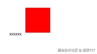
-
display: inline-grid;
<!DOCTYPE html>
<html lang="en">
  <head>
    <meta charset="UTF-8" />
    <meta name="viewport" content="width=device-width, initial-scale=1.0" />
    <title>Document</title>
    <style>
        body{
        margin: 50px;
        }
     .box {
        width: 100px;
        height: 100px;

        background-color: red;
        margin: 10px;
        display: inline-grid;
        box-sizing: border-box;
        padding: 10px;
        border: 1px solid #d2d0d0;
     }
     </style>
  </head>
  <body>
    <span>xxxxxx</span>
    <span class="box"></div>
  </body>
</html>
4.划分行列
-
网格有点类似表格,也
行和列。使用grid-template-columns规则可划分 列数 ,使用grid-template-rows划分 行数 。
1.固定宽度
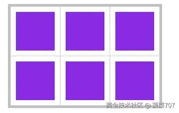
-
我们划分了
3列
3行
元素
3列
3行
元素
<style>
      .box {
        margin: 50px auto;
        display: grid;
        grid-template-columns: 100px 100px 100px; // 3列
        grid-template-rows: 50px 50px 50px; // 3行
        width: 300px;
        height: 300px;
        border: 5px solid #3333;
      }
      .box div {
        padding: 20px;
        background-clip: content-box;
        background-color:blueviolet;
        border: 1px solid #d2d0d0;
      }
    </style>
  </head>
  <body>
    <div class="box">
      <div>1</div>
      <div>2</div>
      <div>3</div>
      <div>4</div>
      <div>5</div>
      <div>6</div>
    </div>
  </body>
2.百分比
-
可以使用使用百分比自动适就容器。
    display

   :

    grid

   ;


    grid-template-columns

   : 33

    .33

   % 33

    .33

   % 33

    .33

   %;  // 三列


    grid-template-rows

   : 50% 50%;  // 两行
3.重复设置
-
使用
repeat统一设置值,第一个参数为重复数量,第二个参数是重复值
   <!DOCTYPE

    html

   >


   <

    html


    lang

   =

    "en"

   >


   <

    head

   >


   <

    meta


    charset

   =

    "UTF-8"

   />


   <

    meta


    name

   =

    "viewport"


    content

   =

    "width=device-width, initial-scale=1.0"

   />


   <

    title

   >
     Document
     </

    title

   >


   <

    style

   >


    .box

   {


    margin

   :

    50px

   auto;


    display

   : grid;


    grid-template-rows

   :

    repeat

   (

    2

   ,

    50%

   );


    grid-template-columns

   :

    repeat

   (

    2

   ,

    50%

   );


    width

   :

    300px

   ;


    height

   :

    200px

   ;


    border

   :

    5px

   solid

    #3333

   ;


   }


    .box


    div

   {


    padding

   :

    20px

   ;


    background-clip

   : content-box;


    background-color

   :

    #f509f1

   ;


    border

   :

    1px

   solid

    #d2d0d0

   ;


   }


   </

    style

   >


   </

    head

   >


   <

    body

   >


   <

    div


    class

   =

    "box"

   >


   <

    div

   >
     1
     </

    div

   >


   <

    div

   >
     2
     </

    div

   >


   <

    div

   >
     3
     </

    div

   >


   <

    div

   >
     4
     </

    div

   >


   </

    div

   >


   </

    body

   >


   </

    html

   >
-
可以设置多个值来定义重复,下面定义四列
100px 50px重复排列。
    display

   :

    grid

   ;


    grid-template-rows

   :

    repeat

   (2, 50%);


    grid-template-columns

   :

    repeat

   (2, 100

    px

   50

    px

   );
repeat
函数第一个参数是重复几次 后面的值**个数 **是他循环重复次数,如上面
grid-template-columns: repeat(2, 100px 50px);
就展示了4列 公式:
重复次数 * 参数的个数=2*2 =4
4.自动填充
-
自动填充是根据容器尺寸,自动设置元素尺寸。
   <!DOCTYPE

    html

   >


   <

    html


    lang

   =

    "en"

   >


   <

    head

   >


   <

    meta


    charset

   =

    "UTF-8"

   />


   <

    meta


    name

   =

    "viewport"


    content

   =

    "width=device-width, initial-scale=1.0"

   />


   <

    title

   >
     Document
     </

    title

   >


   <

    style

   >


    .box

   {


    margin

   :

    50px

   auto;


    display

   : grid;


    grid-template-columns

   :

    repeat

   (auto-fit,

    100px

   );


    grid-template-rows

   :

    repeat

   (auto-fit,

    100px

   );


    width

   :

    300px

   ;


    height

   :

    200px

   ;


    border

   :

    5px

   solid

    #3333

   ;


   }


    .box


    div

   {


    padding

   :

    20px

   ;


    background-clip

   : content-box;


    background-color

   : blueviolet;


    border

   :

    1px

   solid

    #d2d0d0

   ;


   }


   </

    style

   >


   </

    head

   >


   <

    body

   >


   <

    div


    class

   =

    "box"

   >


   <

    div

   >
     1
     </

    div

   >


   <

    div

   >
     2
     </

    div

   >


   <

    div

   >
     3
     </

    div

   >


   <

    div

   >
     4
     </

    div

   >


   <

    div

   >
     5
     </

    div

   >


   <

    div

   >
     6
     </

    div

   >


   </

    div

   >


   </

    body

   >


   </

    html

   >
5.比例划分
1. 单位组合
-
使用 fr单位设置元素在空间中所占的比例,下面按1份-2份分成两组共四列。
width: 300px;
height: 200px;
display: grid;
grid-template-rows: 1fr 2fr;
grid-template-columns: 100px 1fr 2fr;
2.重复定义
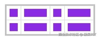
    width

   : 300

    px

   ;


    height

   : 200

    px

   ;


    display

   :

    grid

   ;


    grid-template-rows

   :

    repeat

   (2, 1

    fr

   );


    grid-template-columns

   :

    repeat

   (2,1

    fr

   ,2

    fr

   );
height : 200 px ;
display : grid ;
grid-template-rows : repeat (2, 1 fr );
grid-template-columns : repeat (2,1 fr ,2 fr );
6.自动空间
-
下面为第二个网格列使用
auto来让其获取所有剩余空间
   <

    style

   >


   .box {


   margin: 50px auto;


   /* width: 300px; */


   height: 200px;


   display: grid;


   grid-template-columns: 10vw auto 20vw;


   /*grid-template-columns: 10vw 1fr 20vw;*/ 1fr其实也是一样的


   border: 5px solid #3333;


   }


   .box div {


   padding: 20px;


   background-clip: content-box;


   background-color: blueviolet;


   color: #fff;


   border: 1px solid #d2d0d0;


   }


   </

    style

   >


   <

    body

   >


   <

    div


    class

   =

    "box"

   >


   <

    div

   >
     1
     </

    div

   >


   <

    div

   >
     auto
     </

    div

   >


   <

    div

   >
     3
     </

    div

   >


   </

    div

   >


   </

    body

   >
7.组合定义
grid-tempalte
是
grid-template-rows
、
grid-template-columns
、
grid-template-areas
的三个属性的简写。
下面使用
grid-template
实现二行三列的布局
   <

    style

   >


    .box

   {


    margin

   :

    50px

   auto;


    width

   :

    300px

   ;


    height

   :

    200px

   ;


    display

   : grid;


    grid-template

   :

    repeat

   (

    2

   ,

    1

   fr) /

    repeat

   (

    3

   ,

    1

   fr);


    border

   :

    1px

   solid red;


   }


    .box


    div

   {


    padding

   :

    20px

   ;


    background-clip

   : content-box;


    color

   :

    #fff

   ;


    border

   :

    1px

   solid red;


   }


   </

    style

   >


   <

    body

   >


   <

    div


    class

   =

    "box"

   >


   <

    div

   >
     1
     </

    div

   >


   <

    div

   >
     2
     </

    div

   >


   <

    div

   >
     3
     </

    div

   >


   <

    div

   >
     4
     </

    div

   >


   <

    div

   >
     5
     </

    div

   >


   <

    div

   >
     6
     </

    div

   >


   </

    div

   >


   </

    body

   >
grid-template
同时声明
grid-template-rows、grid-template-columns
。
   <

    style

   >


    .box

   {


    margin

   :

    50px

   auto;


    width

   :

    300px

   ;


    height

   :

    200px

   ;


    display

   : grid;


    grid-template

   :

    50px


    100px


    50px

   /

    150px


    150px

   ;


    border

   :

    5px

   solid

    #d0d0d0

   ;


   }


    .box


    div

   {


    background-clip

   : content-box;


    background-color

   : blueviolet;


    color

   :

    #fff

   ;


    font-size

   :

    20px

   ;


    border

   :

    1px

   solid

    #d0d0d0

   ;


   }


   </

    style

   >


   <

    body

   >


   <

    div


    class

   =

    "box"

   >


   <

    div

   >
     1
     </

    div

   >


   <

    div

   >
     2
     </

    div

   >


   <

    div

   >
     3
     </

    div

   >


   <

    div

   >
     4
     </

    div

   >


   <

    div

   >
     5
     </

    div

   >


   <

    div

   >
     6
     </

    div

   >


   </

    div

   >


   </

    body

   >
-
下面是使用
grid-template定义grid-template-areas,有关grid-template-areas的使用方法会在下面介绍。 -
    <style>
      .box {
        margin: 50px auto;
        width: 300px;
        display: grid;
        /* 点代表占位符 一个甚至多个  */
        grid-template:
          'header header .' 100px
          '. main main' 200px
          'footer . .' 300px;
        border: 5px solid #d0d0d0;
      }
      .box div {
        background-clip: content-box;
        background-color: blueviolet;
        color: #fff;
        font-size: 20px;
        border: 1px solid #d0d0d0;
      }
      div:nth-child(1) {
        grid-area: header;
      }
      div:nth-child(2) {
        grid-area: main;
      }
      div:nth-child(3) {
        grid-area: footer;
      }
    </style>
      <body>
    <div class="box">
      <div>1</div>
      <div>2</div>
      <div>3</div>
    </div>
  </body>
8.最大最小值
使用
minmax
方法可以设置取值范围,下列在行高在
最小50px ~ 最大1fr
间取值。
   <

    style

   >


    .box

   {


    margin

   :

    50px

   auto;


    min-width

   :

    150px

   ;


    height

   :

    200px

   ;


    display

   : grid;


    grid-template-columns

   :

    repeat

   (

    3

   , minmax(

    50px

   ,

    1

   fr));


    grid-template-rows

   :

    repeat

   (

    2

   , minmax(

    100px

   ,

    1

   fr));


    border

   :

    5px

   solid

    #d0d0d0

   ;


   }


    .box


    div

   {


    background-clip

   : content-box;


    background-color

   : blueviolet;


    color

   :

    #fff

   ;


    font-size

   :

    20px

   ;


    border

   :

    1px

   solid

    #d0d0d0

   ;


   }


   </

    style

   >


   <

    body

   >


   <

    div


    class

   =

    "box"

   >


   <

    div

   >
     1
     </

    div

   >


   <

    div

   >
     2
     </

    div

   >


   <

    div

   >
     3
     </

    div

   >


   <

    div

   >
     4
     </

    div

   >


   </

    div

   >


   </

    body

   >
5.间距定义
1.行间距
使用
row-gap
设置行间距。
    width

   : 300

    px

   ;


    height

   : 200

    px

   ;


    display

   :

    grid

   ;


    grid-template-rows

   :

    repeat

   (2, 1

    fr

   );


    grid-template-columns

   :

    repeat

   (3, 1

    fr

   );


    row-gap

   : 30

    px

   ;
2.列间距
使用
column-gap
设置行间距。
3.组合定义
-
使用 gap规则可以一次定义行、列间距,如果间距一样可以只设置一个值。 - 设置行列间距为 20px 与 10px
width: 300px;
height: 200px;
display: grid;
grid-template-rows: repeat(2, 1fr);
grid-template-columns: repeat(3, 1fr);
gap: 20px 10px;
    gap

   : 20

    px

   ;
6.元素定位
1.元素定位属性
| 样式属性 | 说明 |
|---|---|
| grid-row-start | 行开始网格线 |
| grid-row-end | 行结束网格线 |
| grid-column-start | 列开始网格线 |
| grid-column-end | 列结束网格线 |
上面几个样式属性可以使用以下值
| 属性值 | 说明 |
|---|---|
| Line | 网格络 |
| span 数值 | 网格包含的网格数量 |
| span 区域名称 | 网格包含到指定的区域名称 |
| auto | 自动设置,默认为一个网格宽度和高度 |
2.根据网格线
-
通过设置具体的第几条网格线来设置区域位置,设置的数值可以是正数和负数
   <!DOCTYPE

    html

   >


   <

    html


    lang

   =

    "en"

   >


   <

    head

   >


   <

    meta


    charset

   =

    "UTF-8"

   />


   <

    meta


    name

   =

    "viewport"


    content

   =

    "width=device-width, initial-scale=1.0"

   />


   <

    title

   >
     Document
     </

    title

   >


   <

    style

   >


   * {


   margin: 0;


   padding: 0;


   }


   .header {


   margin: 50px;


   display: grid;


   width: 300px;


   height: 300px;


   grid-template-columns: repeat(3, 100px);


   grid-template-rows: repeat(3, 100px);


   border: 5px solid #cfcfce;


   }


   .header .div1 {


   background-color: blueviolet;


   grid-column-start: 2; // 相当于图上所画的 cloumn 2


   grid-column-end: 3;   // 相当于图上所画的 cloumn 3


   grid-row-start: 2;  // 相当于图上所画的 row 2


   grid-row-end: 3;  // 相当于图上所画的 row 3


   color: white;


   }


   </

    style

   >


   </

    head

   >


   <

    body

   >


   <

    div


    class

   =

    "header"

   >


   <

    div


    class

   =

    "div1"

   >
     1
     </

    div

   >


   </

    div

   >


   </

    body

   >


   </

    html

   >
3.根据偏移量
使用
span
可以设置包含网格的数量或包含到的区域名称。
| 示例 | 说明 |
|---|---|
| grid-row-end:2 | 向下包含 2 行 |
| grid-row-start:2 | 向上包含 2 行 |
| grid-column-end:2 | 向右包含 2 行 |
| grid-column-start:2 | 向左包含 2 行 |
<!DOCTYPE html>
<html lang="en">
  <head>
    <meta charset="UTF-8" />
    <meta name="viewport" content="width=device-width, initial-scale=1.0" />
    <title>Document</title>
    <style>
      * {
        margin: 0;
        padding: 0;
      }

      .header {
        margin: 50px;
        display: grid;
        width: 300px;
        height: 300px;
        grid-template-columns: repeat(3, 100px);
        grid-template-rows: repeat(3, 100px);
        border: 5px solid #cfcfce;
      }
      .header .div1 {
        background-color: blueviolet;
        grid-column-start: 1;
        grid-column-end: span 2;
        grid-row-start: 1;
        grid-row-end: span 2;
        color: white;
      }
    </style>
  </head>
  <body>
    <div class="header">
      <div class="div1">1</div>
    </div>
  </body>
</html>
4.根据网格命名
在第7小节 网格命名 中 独立命名 查看5.根据自动命名
在第7小节 网格命名 中 自动命名 查看6.简写模式
可以使用
grid-row
设置行开始网格线,使用
grid-column
设置结束网格线。
上例中的
垂直水平居中对齐元素
,可以使用以下简写的方式声明(推荐)。
    grid-column

   : 2/3;


    grid-row

   : 2/3;
7.更加简写的模式
grid-area
更加简洁是同时对
grid-row
与
grid-column
属性的组合声明。
语法结构如下:
grid-area:grid-row-start/grid-column-start/grid-row-end/grid-column-end。
grid-area:2/2/3/3
8.实现类似于bootstrap的布局
下面是 bootstrap 网格系统的开发,根据指定的样式自动设置网格大小。我把一列画成12列
<!DOCTYPE html>
<html lang="en">
  <head>
    <meta charset="UTF-8" />
    <meta name="viewport" content="width=device-width, initial-scale=1.0" />
    <title>Document</title>
    <style>
      * {
        margin: 0;
        padding: 0;
      }
       .col-1 {
        grid-column: span 1;
      }
      .col-2 {
        grid-column: span 2;
      }
      .col-3 {
        grid-column: span 3;
      }
      .col-4 {
        grid-column: span 4;
      }
      .col-5 {
        grid-column: span 5;
      }
      .col-6 {
        grid-column: span 6;
      }
      .col-7 {
        grid-column: span 7;
      }
      .col-8 {
        grid-column: span 8;
      }

      .col-9 {
        grid-column: span 9;
      }
      .col-10 {
        grid-column: span 10;
      }
      .col-11 {
        grid-column: span 11;
      }
      .col-12 {
        grid-column: span 12;
      }
      .container {
        width: 1200px;
        margin: 0 auto;
      }
      .main {
        display: grid;
        grid-template-columns: repeat(12, 1fr);
      }
      [class^='col-'] {
        background-color: #d123f0;
        border: 1px solid #e8e8e8;
        padding: 10px;
        box-sizing: border-box;
        background-clip: content-box;
      }
    </style>
  </head>
  <body>
    <div class="container main">
      <div class="col-2">1</div>
      <div class="col-1">2</div>
      <div class="col-8">3</div>
    </div>
  </body>
</html>
7.网格命名
网格线可以使用命名与编号找到,方便控制指定网格,或将内容添加到指定网格中。
1.独立命名
可以为每个网格独立命名来进行调用。我们让元素跑到中间去我创建一个3行3列的网格
   <!DOCTYPE

    html

   >


   <

    html


    lang

   =

    "en"

   >


   <

    head

   >


   <

    meta


    charset

   =

    "UTF-8"

   />


   <

    meta


    name

   =

    "viewport"


    content

   =

    "width=device-width, initial-scale=1.0"

   />


   <

    title

   >
     Document
     </

    title

   >


   <

    style

   >


   * {


    margin

   :

    0

   ;


    padding

   :

    0

   ;


   }


    .header

   {


    margin

   :

    50px

   ;


    display

   : grid;


    width

   :

    300px

   ;


    height

   :

    300px

   ;


    grid-template-columns

   : [c1-start]

    100px

   [c1-end c2-start]

    100px

   [c2-end c3-start]

    100px

   [c3-end];


    grid-template-rows

   : [r1-start]

    100px

   [r1-end r2-start]

    100px

   [r2-end r3-start]

    100px

   [r3-end];


    border

   :

    5px

   solid

    #cfcfce

   ;


   }


    .header


    .div1

   {


    background-color

   : blueviolet;


    grid-row-start

   : r2-start;


    grid-column-start

   : c1-end;


    grid-row-end

   : r2-end;


    grid-column-end

   : c3-start;


    color

   : white;


   }


   </

    style

   >


   </

    head

   >


   <

    body

   >


   <

    div


    class

   =

    "header"

   >


   <

    div


    class

   =

    "div1"

   >
     1
     </

    div

   >


   </

    div

   >


   </

    body

   >


   </

    html

   >
2.自动命名
上面那种方式过于麻烦了,创建一个列或者行就要给名字,我们用重复函数repeat来实现
   <

    style

   >


   * {


    margin

   :

    0

   ;


    padding

   :

    0

   ;


   }


    .header

   {


    margin

   :

    50px

   ;


    display

   : grid;


    width

   :

    300px

   ;


    height

   :

    300px

   ;


   /* grid-template-columns: [c1-start] 100px [c1-end c2-start] 100px [c2-end c3-start] 100px [c3-end];


   grid-template-rows: [r1-start] 100px [r1-end r2-start] 100px [r2-end r3-start] 100px [r3-end]; */


    grid-template-columns

   :

    repeat

   (

    3

   , [c-start]

    100px

   [c-end]);


    grid-template-rows

   :

    repeat

   (

    3

   , [r-start]

    100px

   [r-end]);


    border

   :

    5px

   solid

    #cfcfce

   ;


   }


    .header


    .div1

   {


    background-color

   : blueviolet;


    grid-row-start

   : r-start

    2

   ;


    grid-column-start

   : c-start

    2

   ;


    grid-row-end

   : r-start

    2

   ;


    grid-column-end

   : c-end

    2

   ;


    color

   : white;


   }


   </

    style

   >


   <

    body

   >


   <

    div


    class

   =

    "header"

   >


   <

    div


    class

   =

    "div1"

   >
     1
     </

    div

   >


   </

    div

   >


   </

    body

   >
8.区域定位
其实在第6小节的元素定位提到过,在这里我们在这里详细在讲讲,通过
grid-area
属性可以将元素放在指定区域中。
grid-area
由
grid-row-start
、
grid-column-start
、
grid-row-end
、
grid-column-end
的简写模式。
1.编号定位
下例中将元素放在容器的中心位置中的网格中
   <!DOCTYPE

    html

   >


   <

    html


    lang

   =

    "en"

   >


   <

    head

   >


   <

    meta


    charset

   =

    "UTF-8"

   />


   <

    meta


    name

   =

    "viewport"


    content

   =

    "width=device-width, initial-scale=1.0"

   />


   <

    title

   >
     Document
     </

    title

   >


   <

    style

   >


   * {


    margin

   :

    0

   ;


    padding

   :

    0

   ;


   }


    .header

   {


    margin

   :

    50px

   ;


    display

   : grid;


    width

   :

    300px

   ;


    height

   :

    300px

   ;


    grid-template-columns

   :

    repeat

   (

    3

   ,

    100px

   );


    grid-template-rows

   :

    repeat

   (

    3

   ,

    100px

   );


    border

   :

    5px

   solid

    #cfcfce

   ;


   }


    .header


    .div1

   {


    background-color

   : blueviolet;


    grid-area

   :

    2

   /

    2

   /

    3

   /

    3


   color: white;


   }


   </

    style

   >


   </

    head

   >


   <

    body

   >


   <

    div


    class

   =

    "header"

   >


   <

    div


    class

   =

    "div1"

   >
     1
     </

    div

   >


   </

    div

   >


   </

    body

   >


   </

    html

   >
2.命名定位
同样是上面的例子可以使用网格线命名来附加元素。
<!DOCTYPE html>
<html lang="en">
  <head>
    <meta charset="UTF-8" />
    <meta name="viewport" content="width=device-width, initial-scale=1.0" />
    <title>Document</title>
    <style>
      * {
        margin: 0;
        padding: 0;
      }

      .header {
        margin: 50px;
        display: grid;
        width: 300px;
        height: 300px;
        grid-template-columns: repeat(auto-fill, [c] 100px);
        grid-template-rows: repeat(auto-fill, [r] 100px);
        border: 5px solid #cfcfce;
      }
      .header .div1 {
        background-color: blueviolet;
        grid-area: r 2 / c 2 / r 3 / c 3;
        color: white;
      }
    </style>
  </head>
  <body>
    <div class="header">
      <div class="div1">1</div>
    </div>
  </body>
</html>
9.区域声明
区域是由多个单元格构成,使用
grid-template-areas
可以定义网格区域,
并且网格区域必须是矩形的
。
1.区域布局
下面是使用栅格区域布局移动端页面结构
   <

    style

   >


    body

   {


    width

   :

    100vw

   ;


    height

   :

    100vh

   ;


    display

   : grid;


    grid-template-rows

   :

    80px


    1

   fr

    50px

   ;


    grid-template-columns

   :

    100px


    1

   fr

    50px


    60px

   ;


    grid-template-areas

   :

    "header header header header"


    "nav main main aside"


    "footer footer footer footer"

   ;


   }


    main

   {


    /* 完整的写法,推荐使用下面的简写方式*/


    /* grid-area: main-start/main-start/main-end/main-end; */


    /*推荐使用下面的简写方式*/


    grid-area

   : main;


    background

   :

    #E9EEEF

   ;


   }


    header

   {


    background

   :

    #2EC56C

   ;


    grid-area

   : header;


   }


    nav

   {


    background

   :

    #E1732C

   ;


    grid-area

   : nav;


   }


    aside

   {


    grid-area

   : aside;


    background

   :

    #EEBC31

   ;


   }


    footer

   {


    grid-area

   : footer;


    background

   :

    #904FA9

   ;


   }


   </

    style

   >


   <

    body

   >


   <

    header

   >
     </

    header

   >


   <

    nav

   >
     </

    nav

   >


   <

    main

   >
     </

    main

   >


   <

    aside

   >
     </

    aside

   >


   <

    footer

   >
     </

    footer

   >


   </

    body

   >
2.简写形式
使用 grid-template 进行栅格划分会更简洁。
语法格式为:
 grid-template:
      '栅格名称 栅格名称 栅格名称 栅格名称' 行高
      '栅格名称 栅格名称 栅格名称 栅格名称' 行高
      '栅格名称 栅格名称 栅格名称 栅格名称' 行高/列宽 列宽 列宽 列宽;
下面是使用 grid-template 进行简写的示例
<style>
  body {
    width: 100vw;
    height: 100vh;
    display: grid;
    grid-template:
      'header header header header' 80px
      'nav main main aside' auto
      'footer footer footer footer' 80px / 100px auto 60px 40px;
  }

  main {
    /* 完整的写法,推荐使用下面的简写方式*/
    /* grid-area: main-start/main-start/main-end/main-end; */
    /*推荐使用下面的简写方式*/
    grid-area: main;
    background: #5c59f7;
  }

  header {
    background: #2ec56c;
    grid-area: header;
  }

  nav {
    background: #e1732c;
    grid-area: nav;
  }

  aside {
    grid-area: aside;
    background: #eebc31;
  }

  footer {
    grid-area: footer;
    background: #904fa9;
  }
</style>

<body>
  <header></header>
  <nav></nav>
  <main></main>
  <aside></aside>
  <footer></footer>
</body>
3.区域命名(系统自动命名)
系统会为区域自动命名,上例中的会产生
header-start
水平与垂直同名的起始区域与
header-end
水平与垂直同名的区域终止。
   <

    style

   >


    body

   {


    width

   :

    100vw

   ;


    height

   :

    100vh

   ;


    display

   : grid;


    grid-template

   :


    'header1 header1'


    'nav main'

   auto


    'footer footer'


    60px

   /

    100px


    1

   fr;


   }


    header

   {


    background

   :

    #2ec56c

   ;


    grid-area

   : header1-start/header1-start/main-end/main-end;


   }


    aside

   {


    grid-area

   : aside;


    background

   :

    #eebc31

   ;


   }


    footer

   {


    grid-area

   : footer;


    background

   :

    #904fa9

   ;


   }


   </

    style

   >


   <

    body

   >


   <

    header

   >
     </

    header

   >


   <

    footer

   >
     </

    footer

   >


   </

    body

   >
4.区域占位
使用一个或多个 连续的
.
定义区域占位。
   <

    style

   >


    body

   {


    width

   :

    100vw

   ;


    height

   :

    100vh

   ;


    display

   : grid;


    grid-template

   :


    '.. header'


    '.. main'


    'footer footer'


    60px

   /

    100px


    1

   fr;


   }


    header

   {


    background

   :

    #2ec56c

   ;


    grid-area

   : header-start/header-start/main-end/main-end;


   }


    aside

   {


    grid-area

   : aside;


    background

   :

    #eebc31

   ;


   }


    footer

   {


    grid-area

   : footer;


    background

   :

    #904fa9

   ;


   }


   </

    style

   >


   <

    body

   >


   <

    header

   >
     </

    header

   >


   <

    footer

   >
     </

    footer

   >


   </

    body

   >
10.网格流动
在容器中设置
grid-auto-flow
属性可以改变单元格排列方式。
| 选项 | 说明 |
|---|---|
| column | 按列排序 |
| row | 按行排列 |
| dense | 元素使用前面空余栅格(下面有示例说明) |
1.基本使用
下例将单元按列排序流动
   <

    style

   >


    article

   {


    width

   :

    400px

   ;


    height

   :

    400px

   ;


    display

   : grid;


    grid-template-rows

   :

    repeat

   (

    2

   ,

    1

   fr);


    grid-template-columns

   :

    repeat

   (

    2

   ,

    1

   fr);


    border

   : solid

    5px

   silver;


    grid-auto-flow

   : column;


   }


    div

   {


    background

   : blueviolet;


    background-clip

   : content-box;


    padding

   :

    10px

   ;


    font-size

   :

    35px

   ;


    color

   : white;


   }


   </

    style

   >


   <

    article

   >


   <

    div

   >
     1
     </

    div

   >


   <

    div

   >
     2
     </

    div

   >


   <

    div

   >
     3
     </

    div

   >


   <

    div

   >
     4
     </

    div

   >


   </

    article

   >
2.强制填充
当我们布局的时候有些空隙这个时候
   <

    style

   >


    article

   {


    width

   :

    400px

   ;


    height

   :

    400px

   ;


    display

   : grid;


    grid-template-rows

   :

    repeat

   (

    2

   ,

    100px

   );


    grid-template-columns

   :

    repeat

   (

    2

   ,

    100px

   );


    border

   : solid

    5px

   silver;


   }


    div

   {


    background

   : blueviolet;


    background-clip

   : content-box;


    padding

   :

    10px

   ;


    font-size

   :

    35px

   ;


    color

   : white;


   }


    div


    :first-child

   {


    grid-column

   :

    2

   /

    4

   ;


   }


    div


    :nth-child(2)

   {


    grid-column

   :

    1

   /

    3

   ;


   }


   </

    style

   >


   ...


   <

    article

   >


   <

    div

   >
     1
     </

    div

   >


   <

    div

   >
     2
     </

    div

   >


   <

    div

   >
     3
     </

    div

   >


   <

    div

   >
     4
     </

    div

   >


   </

    article

   >
grid-auto-flow: row dense;
可以执行填充空白区域操作。
我们可以使用 **grid-auto-flow: row dense; **
    article

   {


    width

   :

    400px

   ;


    height

   :

    400px

   ;


    display

   : grid;


    grid-template-rows

   :

    repeat

   (

    2

   ,

    100px

   );


    grid-template-columns

   :

    repeat

   (

    2

   ,

    100px

   );


    border

   : solid

    5px

   silver;


    grid-auto-flow

   : row dense;


   }
11.对齐管理
可以通过属性方便的定义栅格或元素的对齐方式
| 选项 | 说明 | 对象 |
|---|---|---|
| justify-content | 所有栅格在容器中的水平对齐方式,容器有额外空间时 | 栅格容器 |
| align-content | 所有栅格在容器中的垂直对齐方式,容器有额外空间时 | 栅格容器 |
| align-items | 栅格内所有元素的垂直排列方式 | 栅格容器 |
| justify-items | 栅格内所有元素的横向排列方式栅格内所有元素的横向排列方式 | 栅格容器栅格容器 |
| align-self | 元素在栅格中垂直对齐方式 | 栅格元素 |
| justify-self | 元素在栅格中水平对齐方式 | 栅格元素 |
1.网格对齐
justify-content 与 align-content 用于控制栅格的对齐方式,比如在栅格的尺寸小于容器的里面时,控制栅格的布局方式。
justify-content 属性的值如下
| 值 | 说明 |
|---|---|
| start | 容器左边 |
| end | 容器右边 |
| center | 容器中间 |
| stretch | 撑满容器 |
| space-between | 第一个栅格靠左边,最后一个栅格靠右边,余下元素平均分配空间 |
| space-around | 每个元素两侧的间隔相等。所以,栅格之间的间隔比栅格与容器边距的间隔大一倍 |
| space-evenly | 栅格间距离完全平均分配 |
align-content 属性的值如下
   border

  :

   solid

  5

   px


   silver

  ;


   width

  : 600

   px

  ;


   height

  : 600

   px

  ;


   display

  :

   grid

  ;


   grid-template-columns

  : 200

   px

  200

   px

  ;


   grid-template-rows

  : 200

   px

  200

   px

  ;


   justify-content

  :

   space-between

  ;


   align-content

  :

   space-evenly

  ;
| 值 | 说明 |
|---|---|
| start | 容器顶边 |
| end | 容器底边 |
| center | 容器垂直中间 |
| stretch | 撑满容器 |
| space-between | 第一个栅格靠左边,最后一个栅格靠右边,余下元素平均分配空间 |
| space-around | 每个元素两侧的间隔相等。所以,栅格之间的间隔比栅格与容器边距的间隔大一倍 |
| space-evenly | 栅格间距离完全平均分配 |
下面是栅格水平与垂直居中对齐的示例
   <!DOCTYPE html>


   <html lang="en">


   <head>


   <meta charset="UTF-8" />


   <meta name="viewport" content="width=device-width, initial-scale=1.0" />


   <title>Document</title>


   <style>


   article {


   display: grid;


   border: 5px solid #d2d0d0;


   height: 400px;


   width: 400px;


   grid-template-columns: repeat(4, 60px);


   justify-content: center;


   align-content: center;


   }


   article div {


   border: 1px solid #d2d0d0;


   padding: 10px;


   background-color: blueviolet;


   box-sizing: border-box;


   height: 50px;


   }


   </style>


   </head>


   <body>


   <article>


   <div>1</div>


   <div>2</div>


   <div>3</div>


   <div>4</div>


   </article>


   </body>


   </html>
2.元素对齐
justify-items 与 align-items 用于控制所有栅格内元素的对齐方式
-
justify-items 用于控制元素的水平对齐方式,可用的属性值如下
| 值 | 说明 |
|---|---|
| start | 元素对齐栅格的左边 |
| end | 元素对齐栅格的右边 |
| center | 元素对齐栅格的中间 |
| stretch | 水平撑满栅格 |
-
align-items 用于控制元素的垂直对齐方式,可用的属性值如下
| 值 | 说明 |
|---|---|
| start | 元素对齐栅格的顶边 |
| end | 元素对齐栅格的底边 |
| center | 元素对齐栅格的垂直中间 |
| stretch | 垂直撑满栅格 |
下面是将元素在所在栅格中水平、垂直居中的示例
   <!DOCTYPE

    html

   >


   <

    html


    lang

   =

    "en"

   >


   <

    head

   >


   <

    meta


    charset

   =

    "UTF-8"

   />


   <

    meta


    name

   =

    "viewport"


    content

   =

    "width=device-width, initial-scale=1.0"

   />


   <

    title

   >
     Document
     </

    title

   >


   <

    style

   >


    article

   {


    display

   : grid;


    border

   :

    5px

   solid

    #d2d0d0

   ;


    height

   :

    100px

   ;


    width

   :

    400px

   ;


    grid-template-columns

   :

    repeat

   (

    4

   ,

    100px

   );


    grid-template-rows

   :

    100px

   ;


    justify-items

   : flex-start;


    align-items

   : center;


   }


    article


    div

   {


    border

   :

    1px

   solid

    #d2d0d0

   ;


    padding

   :

    10px

   ;


    background-color

   : blueviolet;


    box-sizing

   : border-box;


    width

   :

    50px

   ;


    height

   :

    50px

   ;


   }


   </

    style

   >


   </

    head

   >


   <

    body

   >


   <

    article

   >


   <

    div

   >
     1
     </

    div

   >


   <

    div

   >
     2
     </

    div

   >


   <

    div

   >
     3
     </

    div

   >


   <

    div

   >
     4
     </

    div

   >


   </

    article

   >


   </

    body

   >


   </

    html

   >
3.元素独立控制
justify-self 与 align-self 控制单个栅格内元素的对齐方式,属性值与 justify-items 和 align-items 是一致的。
div:first-child {
  justify-self: end;
  align-self: center;
}

div:nth-child(4) {
  justify-self: start;
  align-self: center;
}
4.组合简写
1.place-content
用于控制栅格的对齐方式,语法如下:
place-content: <align-content> <justify-content>
2.place-items
控制所有元素的对齐方式,语法结构如下:
place-items: <align-items> <justify-items>
3.place-self
控制单个元素的对齐方式
place-self: <align-self> <justify-self>
12.自动排列
当栅格无法放置内容时,系统会自动添加栅格用于放置溢出的元素,我们需要使用以下属性控制自动添加栅格的尺寸。
1.属性说明
| 选项 | 说明 | 对象 |
|---|---|---|
| grid-auto-rows | 控制自动增加的栅格行的尺寸,grid-auto-flow:row; 为默认 | 容器 |
| grid-auto-columns | 控制自动增加的栅格列的尺寸,grid-auto-flow: column; | 容器 |
2.自动栅格行
下面定义了 2X2 的栅格,但有多个元素,系统将自动创建栅格用于放置额外元素。我们使用 grid-auto-rows 来控制增加栅格的行高。
-
如果没有定义溢出的高度或宽度,盒子宽/高根据 自身内容而来 -
未设置溢出高度或宽度 -
设置溢出高度
   <!DOCTYPE

    html

   >


   <

    html


    lang

   =

    "en"

   >


   <

    head

   >


   <

    meta


    charset

   =

    "UTF-8"

   />


   <

    meta


    name

   =

    "viewport"


    content

   =

    "width=device-width, initial-scale=1.0"

   />


   <

    title

   >
     Document
     </

    title

   >


   <

    style

   >


   main {


   display: grid;


   grid-template-rows: repeat(2, 50px);


   grid-template-columns: repeat(2, 1fr);


   grid-auto-rows: 100px; // 溢出的高度就是100px


   grid-auto-columns: 200px;


   }


   div {


   background: blueviolet;


   background-clip: content-box;


   border: solid 1px #ddd;


   color: white;


   }


   </

    style

   >


   </

    head

   >


   <

    body

   >


   <

    main

   >


   <

    div

   >
     1
     </

    div

   >


   <

    div

   >
     2
     </

    div

   >


   <

    div

   >
     3
     </

    div

   >


   <

    div

   >
     4
     </

    div

   >


   <

    div

   >
     5
     </

    div

   >


   <

    div

   >
     6
     </

    div

   >


   </

    main

   >


   </

    body

   >


   </

    html

   >
-
我们将改变单元格排列方式。
-
grid-auto-flow: column;
   <!DOCTYPE

    html

   >


   <

    html


    lang

   =

    "en"

   >


   <

    head

   >


   <

    meta


    charset

   =

    "UTF-8"

   />


   <

    meta


    name

   =

    "viewport"


    content

   =

    "width=device-width, initial-scale=1.0"

   />


   <

    title

   >
     Document
     </

    title

   >


   <

    style

   >


    main

   {


    display

   : grid;


    grid-template-rows

   :

    repeat

   (

    2

   ,

    50px

   );


    grid-template-columns

   :

    repeat

   (

    2

   ,

    1

   fr);


    grid-auto-rows

   :

    100px

   ;


    grid-auto-columns

   :

    200px

   ;


    grid-auto-flow

   : column;


   }


    div

   {


    background

   : blueviolet;


    background-clip

   : content-box;


    border

   : solid

    1px


    #ddd

   ;


    color

   : white;


   }


   </

    style

   >


   </

    head

   >


   <

    body

   >


   <

    main

   >


   <

    div

   >
     1
     </

    div

   >


   <

    div

   >
     2
     </

    div

   >


   <

    div

   >
     3
     </

    div

   >


   <

    div

   >
     4
     </

    div

   >


   <

    div

   >
     5
     </

    div

   >


   <

    div

   >
     6
     </

    div

   >


   </

    main

   >


   </

    body

   >


   </

    html

   >
3.自动行列
下面创建了 2X2 栅格,我们将第 2 个 DIV 设置的格栅已经超过了2行2列,所以系统会自动创建栅格。
第2个DIV已经是200x200了
   <!DOCTYPE

    html

   >


   <

    html


    lang

   =

    "en"

   >


   <

    head

   >


   <

    meta


    charset

   =

    "UTF-8"

   />


   <

    meta


    name

   =

    "viewport"


    content

   =

    "width=device-width, initial-scale=1.0"

   />


   <

    title

   >
     Document
     </

    title

   >


   <

    style

   >


    main

   {


    display

   : grid;


    grid-template-rows

   :

    repeat

   (

    2

   ,

    50px

   );


    grid-template-columns

   :

    repeat

   (

    2

   ,

    1

   fr);


    grid-auto-columns

   :

    200px

   ;


    grid-auto-rows

   :

    200px

   ;


   }


    div

   {


    background

   : blueviolet;


    background-clip

   : content-box;


    border

   : solid

    1px


    #ddd

   ;


    color

   : white;


   }


    div


    :nth-child(2)

   {


    grid-area

   :

    3

   /

    3

   /

    4

   /

    3

   ;


   }


   </

    style

   >


   </

    head

   >


   <

    body

   >


   <

    main

   >


   <

    div

   >
     1
     </

    div

   >


   <

    div

   >
     2
     </

    div

   >


   </

    main

   >


   </

    body

   >


   </

    html

   >