AI复现PNAS同款,只需2min
p pythonic生物人 pythonic生物人约 9 分钟
pythonic生物人 pythonic生物人约 9 分钟
大家好,我是
pythonic生物人
。
文献:S. Shen,J.W. Park,Z. Lu,L. Lin,M.D. Henry,Y.N. Wu,Q. Zhou, & Y. Xing, rMATS: Robust and flexible detection of differential alternative splicing from replicate RNA-Seq data, Proc. Natl. Acad. Sci. U.S.A. 111 (51) E5593-E5601, https://doi.org/10.1073/
pnas
.1419161111 (2014).
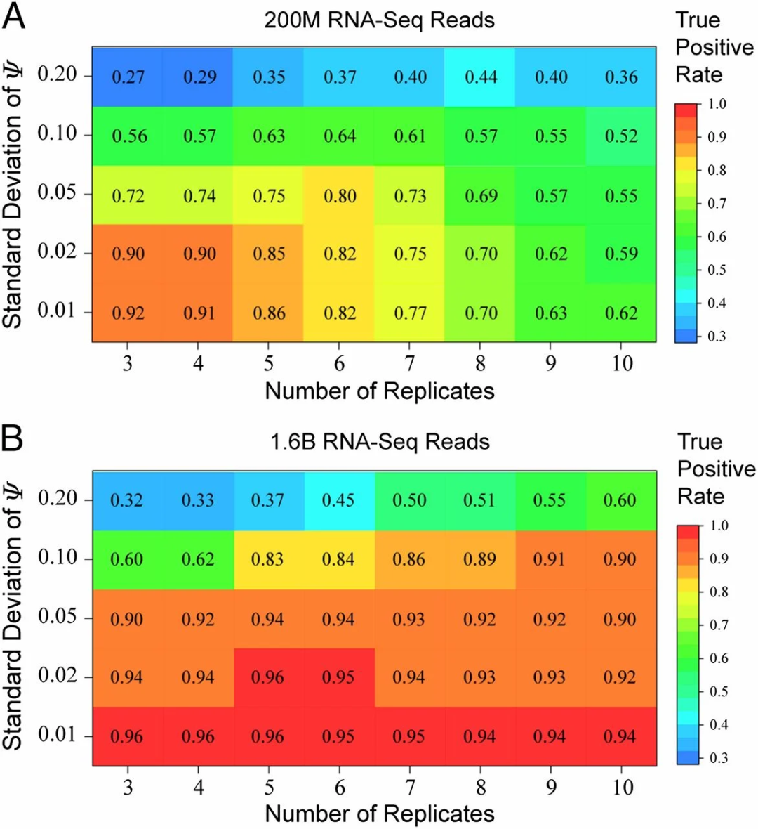
原文中的Fig. 5展示的内容:通过模拟研究评估样本量和测序深度对检测准确性的影响。在样本组内模拟了五种不同的标准差(SD = 0.01, 0.02, 0.05, 0.10 和 0.20)。计算并绘制了每组模拟数据在 5% 假阳性率下的真实阳性率。(A) 每个样本组模拟了总计 2 亿(200M)条双端读段,并分配至 3–10 个重复样本中。(B) 每个样本组模拟了总计 16 亿(1.6B)条双端读段,并分配至 3–10 个重复样本中。
其中,
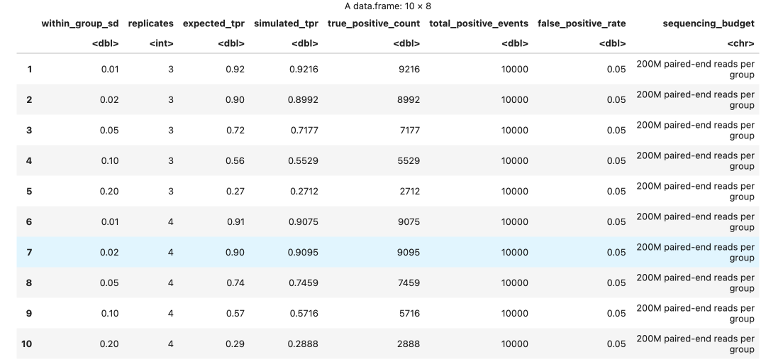
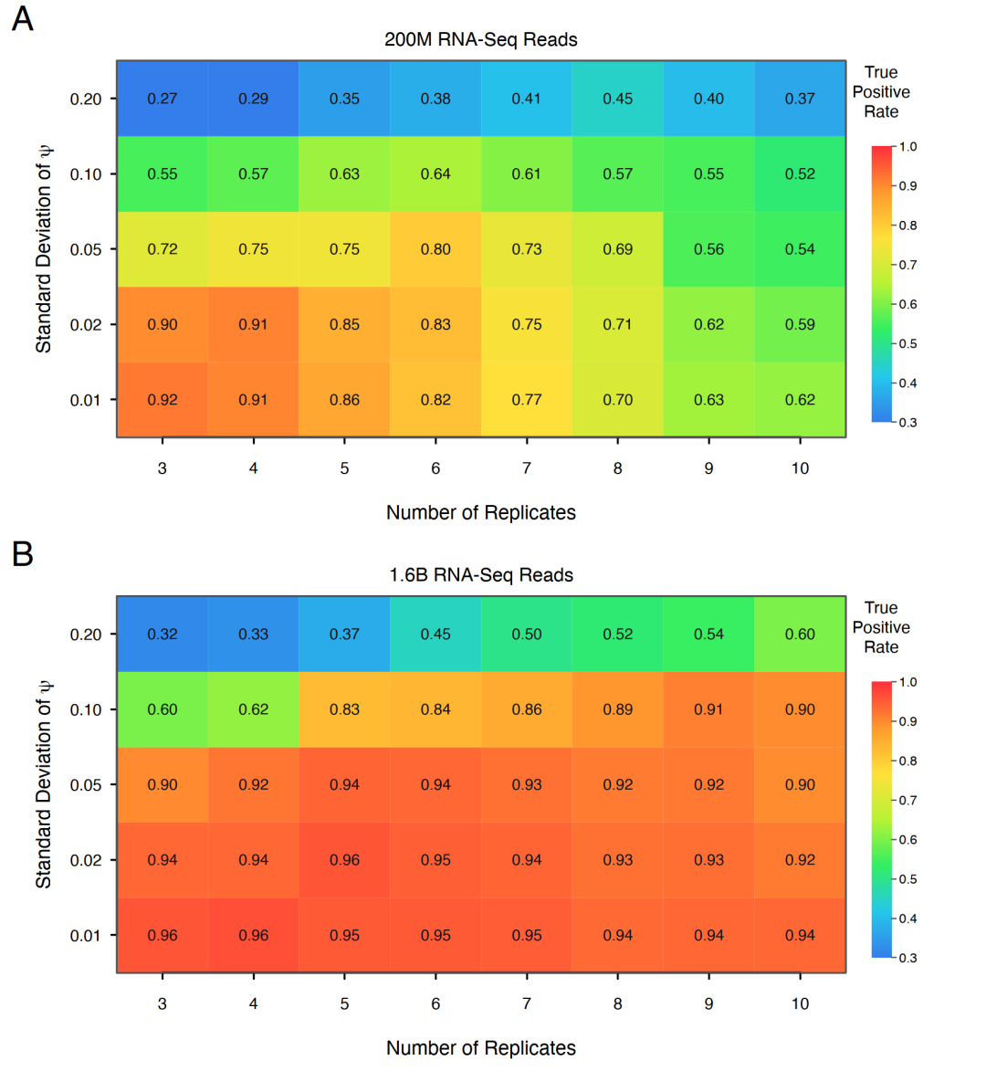
几乎100%复现,但是,base r代码太过繁琐,下面尝试AI + ggplot2+patchwork简化代码。
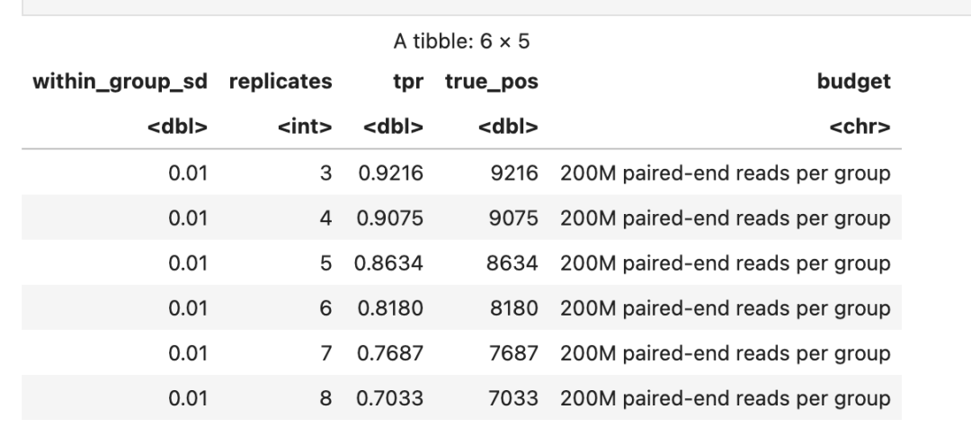
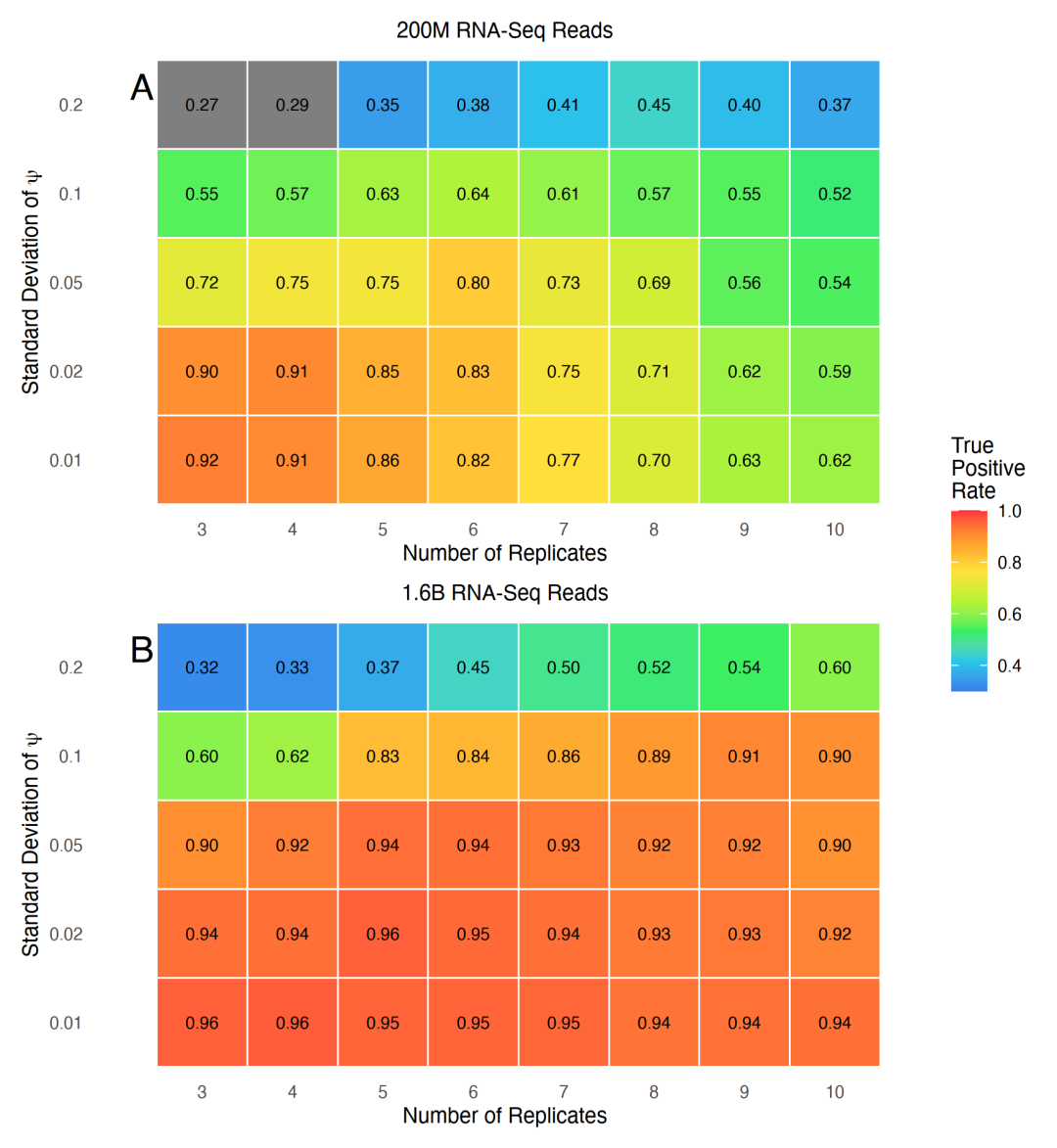
结果都无限接近原图。
往期精彩 2026可视化工具TOP3 复现IF50.0期刊上6张图 复现Science正刊图 复现顶刊forestplot 师姐认为你会的55个科研图表 师弟师妹偷偷用的7大科研图表 复现Nature中的PCA图 复现Cell图
- X轴,生物学重复数(3到10个),代表每个实验组内独立样本的数量。
- Y轴,组内标准差(ψ,0.01到0.20),代表基因在组内个体间的表达变异程度,数值越大表示该基因在同类样本中表达越不稳定。
- 颜色与数字,每个格子中的数字是真阳性率(TPR),颜色从蓝到红代表TPR从低(约30%)到高(接近100%),是衡量检测可靠性的核心指标。
AI + base r实现
AI提示词: 模拟数据,复现pnas.1419161111中的Fig. 5,使用base r实现。- 模拟数据
set.seed(1419165)
options(repr.plot.width=7.0, repr.plot.height=7.6, repr.plot.res=250, bitmapType="cairo")

# 基础参数
replicate_counts <- 3:10
within_group_sd <- c(0.01, 0.02, 0.05, 0.10, 0.20)

# 200M reads期望检测率矩阵(行=SD,列=重复数)
expected_tpr_200m <- rbind(
  c(0.92,0.91,0.86,0.82,0.77,0.70,0.63,0.62),
  c(0.90,0.90,0.85,0.82,0.75,0.70,0.62,0.59),
  c(0.72,0.74,0.75,0.80,0.73,0.69,0.57,0.55),
  c(0.56,0.57,0.63,0.64,0.61,0.57,0.55,0.52),
  c(0.27,0.29,0.35,0.37,0.40,0.44,0.40,0.36)
)

# 1.6B reads期望检测率矩阵
expected_tpr_1_6b <- rbind(
  c(0.96,0.96,0.96,0.95,0.95,0.94,0.94,0.94),
  c(0.94,0.94,0.96,0.95,0.94,0.93,0.93,0.92),
  c(0.90,0.92,0.94,0.94,0.93,0.92,0.92,0.90),
  c(0.60,0.62,0.83,0.84,0.86,0.89,0.91,0.90),
  c(0.32,0.33,0.37,0.45,0.50,0.51,0.55,0.60)
)

# 设置行列名
dimnames(expected_tpr_200m) <- list(sprintf("%.2f", within_group_sd), replicate_counts)
dimnames(expected_tpr_1_6b) <- dimnames(expected_tpr_200m)

# 模拟检测率:二项分布抽样
n_positive_events <- 10000
simulate_detection_surface <- function(expected_probability) {
  matrix(
    rbinom(length(expected_probability), size=n_positive_events, prob=as.vector(expected_probability)) / n_positive_events,
    nrow=nrow(expected_probability),
    ncol=ncol(expected_probability),
    dimnames=dimnames(expected_probability)
  )
}

simulated_tpr_200m <- simulate_detection_surface(expected_tpr_200m)
simulated_tpr_1_6b <- simulate_detection_surface(expected_tpr_1_6b)

# 转换为长表
make_long_data <- function(expected, simulated, budget) {
  grid <- expand.grid(
    within_group_sd=within_group_sd,
    replicates=replicate_counts,
    KEEP.OUT.ATTRS=FALSE
  )
  grid$expected_tpr <- as.vector(expected)
  grid$simulated_tpr <- as.vector(simulated)
  grid$true_positive_count <- round(grid$simulated_tpr * n_positive_events)
  grid$total_positive_events <- n_positive_events
  grid$false_positive_rate <- 0.05
  grid$sequencing_budget <- budget
  grid
}

# 合并两个测序深度的数据
simulated_data_pnas_fig5 <- rbind(
  make_long_data(expected_tpr_200m, simulated_tpr_200m, "200M paired-end reads per group"),
  make_long_data(expected_tpr_1_6b, simulated_tpr_1_6b, "1.6B paired-end reads per group")
)
row.names(simulated_data_pnas_fig5) <- NULL
head(simulated_data_pnas_fig5,n=10)
- 自定义颜色映射
# 自定义颜色映射
heat_palette <- grDevices::colorRampPalette(c(
  "#347EEB","#25C8EA","#31EF63","#B7F335",
  "#FFE13B","#FF9B2E","#FF303C"
))(256)
color_limits <- c(0.30, 1.00)

tpr_to_color <- function(value) {
  scaled <- (value - color_limits[1]) / diff(color_limits)
  color_index <- round(pmax(0, pmin(1, scaled)) * 255) + 1
  heat_palette[color_index]
}
- 绘制热图
# 绘制热图
draw_tpr_heatmap <- function(values, panel_title, panel_label) {
  par(mar=c(4.2,5.0,2.6,0.5), mgp=c(2.6,0.65,0), tcl=-0.25, xaxs="i", yaxs="i")

  plot(NA, xlim=c(0.5, length(replicate_counts)+0.5), ylim=c(0.5, length(within_group_sd)+0.5),
       xlab="Number of Replicates", ylab=expression(paste("Standard Deviation of ", psi)),
       axes=FALSE, frame.plot=TRUE)

  # 逐格绘制
  for (row_index in seq_along(within_group_sd)) {
    for (column_index in seq_along(replicate_counts)) {
      value <- values[row_index, column_index]
      rect(column_index-0.5, row_index-0.5, column_index+0.5, row_index+0.5,
           col=tpr_to_color(value), border=grDevices::adjustcolor("white", alpha.f=0.10), lwd=0.35)
      text(column_index, row_index, labels=sprintf("%.2f", value), cex=0.78, col="#111111")
    }
  }

  axis(1, at=seq_along(replicate_counts), labels=replicate_counts, cex.axis=0.82)
  axis(2, at=seq_along(within_group_sd), labels=sprintf("%.2f", within_group_sd), las=1, cex.axis=0.82)
  box(col="#555555", lwd=0.8)

  title(main=panel_title, cex.main=0.96, font.main=1, line=0.65)
  mtext(panel_label, side=3, line=1.20, adj=-0.15, font=1, cex=1.45, xpd=NA)
}

# 绘制颜色条
draw_color_key <- function() {
  par(mar=c(4.2,0.4,2.6,2.9), xaxs="i", yaxs="i")

  plot(NA, xlim=c(0,1), ylim=c(0.27,1.02), axes=FALSE, xlab="", ylab="", frame.plot=FALSE)

  color_breaks <- seq(color_limits[1], color_limits[2], length.out=257)
  map_key_y <- function(value) {
    0.30 + (value - color_limits[1]) / diff(color_limits) * 0.55
  }

  for (i in seq_len(256)) {
    rect(0.10, map_key_y(color_breaks[i]), 0.48, map_key_y(color_breaks[i+1]),
         col=heat_palette[i], border=NA)
  }

  color_ticks <- seq(0.3, 1.0, by=0.1)
  color_tick_y <- map_key_y(color_ticks)
  segments(0.48, color_tick_y, 0.57, color_tick_y, col="#444444", lwd=0.65)
  text(0.63, color_tick_y, labels=sprintf("%.1f", color_ticks), adj=c(0,0.5), cex=0.65)
  text(0.28, 1.01, labels="TruenPositivenRate", adj=c(0.5,1), cex=0.84, xpd=NA)
}

# 拼图函数
draw_pnas_fig5 <- function() {
  old_par <- par(no.readonly=TRUE)
  layout(matrix(c(1,2,3,4), nrow=2, byrow=TRUE), widths=c(6.0,0.9), heights=c(1,1))
  on.exit({ layout(matrix(1)); par(old_par) })

  draw_tpr_heatmap(simulated_tpr_200m, "200M RNA-Seq Reads", "A")
  draw_color_key()
  draw_tpr_heatmap(simulated_tpr_1_6b, "1.6B RNA-Seq Reads", "B")
  draw_color_key()
}

# 绘图
draw_pnas_fig5()
AI + ggplot2实现
AI提示词: 模拟数据,复现pnas.1419161111中的Fig. 5,使用ggplot2实现。- 模拟数据
set.seed(1419165)
library(tidyverse)
library(patchwork)

# 基础参数
replicate_counts <- 3:10
within_group_sd <- c(0.01, 0.02, 0.05, 0.10, 0.20)
n_pos <- 1e4

# 期望TPR矩阵(行=SD,列=重复数)
expected_tpr_200m <- matrix(
  c(
    0.92,0.91,0.86,0.82,0.77,0.70,0.63,0.62,
    0.90,0.90,0.85,0.82,0.75,0.70,0.62,0.59,
    0.72,0.74,0.75,0.80,0.73,0.69,0.57,0.55,
    0.56,0.57,0.63,0.64,0.61,0.57,0.55,0.52,
    0.27,0.29,0.35,0.37,0.40,0.44,0.40,0.36
  ), nrow = 5, byrow = TRUE,
  dimnames = list(sprintf("%.2f", within_group_sd), replicate_counts)
)

expected_tpr_1_6b <- matrix(
  c(
    0.96,0.96,0.96,0.95,0.95,0.94,0.94,0.94,
    0.94,0.94,0.96,0.95,0.94,0.93,0.93,0.92,
    0.90,0.92,0.94,0.94,0.93,0.92,0.92,0.90,
    0.60,0.62,0.83,0.84,0.86,0.89,0.91,0.90,
    0.32,0.33,0.37,0.45,0.50,0.51,0.55,0.60
  ), nrow = 5, byrow = TRUE,
  dimnames = dimnames(expected_tpr_200m)
)

# 模拟检测率
simulate_tpr <- function(mu) {
  matrix(
    rbinom(length(mu), n_pos, as.vector(mu)) / n_pos,
    nrow = nrow(mu), ncol = ncol(mu),
    dimnames = dimnames(mu)
  )
}

sim_200m <- simulate_tpr(expected_tpr_200m)
sim_1_6b <- simulate_tpr(expected_tpr_1_6b)

# 矩阵转长表
tidy_surface <- function(mat, budget) {
  as_tibble(mat, rownames = "within_group_sd") %>%
    pivot_longer(-within_group_sd, names_to = "replicates", values_to = "tpr") %>%
    mutate(
      replicates = as.integer(replicates),
      within_group_sd = as.numeric(within_group_sd),
      true_pos = round(tpr * n_pos),
      budget = budget
    )
}

sim_data <- bind_rows(
  tidy_surface(sim_200m, "200M paired-end reads per group"),
  tidy_surface(sim_1_6b, "1.6B paired-end reads per group")
)
- 绘制热图
# 绘制热图
plot_heatmap <- function(data, title, label) {
  ggplot(data, aes(replicates, factor(within_group_sd), fill = tpr)) +
    geom_tile(color = "white", linewidth = 0.3) +
    geom_text(aes(label = sprintf("%.2f", tpr)), size = 2.8, color = "black") +
    scale_fill_gradientn(
      colors = c("#347EEB","#25C8EA","#31EF63","#B7F335",
                 "#FFE13B","#FF9B2E","#FF303C"),
      limits = c(0.30, 1.00),
      name = "TruenPositivenRate"
    ) +
    scale_x_continuous(breaks = replicate_counts) +
    labs(
      title = title,
      x = "Number of Replicates",
      y = expression(paste("Standard Deviation of ", psi))
    ) +
    theme_minimal(base_size = 10) +
    theme(
      plot.title = element_text(hjust = 0.5, size = 10),
      panel.grid = element_blank(),
      axis.text.y = element_text(angle = 0, hjust = 1)
    ) +
    annotate("text", x = 2.2, y = 5.2, label = label,
             size = 6, fontface = "bold", hjust = 0)
}

# 构建子图
p1 <- plot_heatmap(
  filter(sim_data, budget == "200M paired-end reads per group"),
  "200M RNA-Seq Reads", "A"
)
p2 <- plot_heatmap(
  filter(sim_data, budget == "1.6B paired-end reads per group"),
  "1.6B RNA-Seq Reads", "B"
)
- 拼图
# 拼图并统一图例
p1 / p2 +
  plot_layout(guides = "collect") &
  theme(legend.position = "right")
往期精彩 2026可视化工具TOP3 复现IF50.0期刊上6张图 复现Science正刊图 复现顶刊forestplot 师姐认为你会的55个科研图表 师弟师妹偷偷用的7大科研图表 复现Nature中的PCA图 复现Cell图